
Oluwatosin
Adesoro

ROLE
UX/UI DESIGNER
Designing a
Sacred
Digital Experience
How I designed Noor - a comprehensive Islamic companion app that balances spiritual depth with modern usability
PLATFORM
iOS | Android
DURATION
2 Weeks
SCREENS
22+ Designed
1.8B
Global Muslim
users
as target
audience
8
Core app screens designed & prototyped
9
Content categories in the audio library
5
Daily prayer times shown with countdown
01
PROJECT OVERVIEW
A companion for the complete Muslim lifestyle
Noor was designed as an all-in-one Islamic lifestyle app combining prayer time alerts, an Islamic calendar, a curated audio library of lectures and Hadith, and spiritual content organized by topic. The challenge: create an experience that feels reverent and culturally authentic, while meeting the usability standards of modern productivity apps.
02
PROBLEM SPACE
Fragmented faith tools create friction
The Problem
Muslim users currently rely on 4–6 different apps — separate tools for prayer times, Quran reading, Islamic lectures, Islamic calendar, and Hadith. This fragmentation breaks focus and spiritual routine. There was no cohesive, beautifully designed experience that unified these needs.
App Fragmentation
Broken Routines
Poor Aesthetics
Generic UI Patterns
Calm UX
Unified Platform
Design Goals
Unify essential Islamic tools into a single, beautifully crafted experience. Respect cultural sensibility through deliberate use of color, Arabic-compatible typography hierarchy, and calm interaction patterns that don't feel distracting during moments of reflection.
Cultural Authenticity
Deep Green Palette
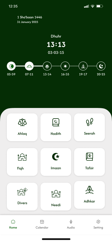
Home Dashboard
Prayer countdown with Hijri date and 9-category content grid

Lecture List
Play-all feature with sort controls and series metadata
03
SCREEN DESIGN
Every screen purposefully crafted
Eight key screens were designed across the core user journey — from prayer time tracking to audio content browsing. Each screen was iterated for visual clarity, spiritual tone, and practical usability.

Islamic Calendar
Dual-date display with Hijri months and Muslim holiday listing

Favorites
Empty state with illustration — designed for future content

Ahlaq — Topics
Categorized Islamic ethics content with numbered navigation
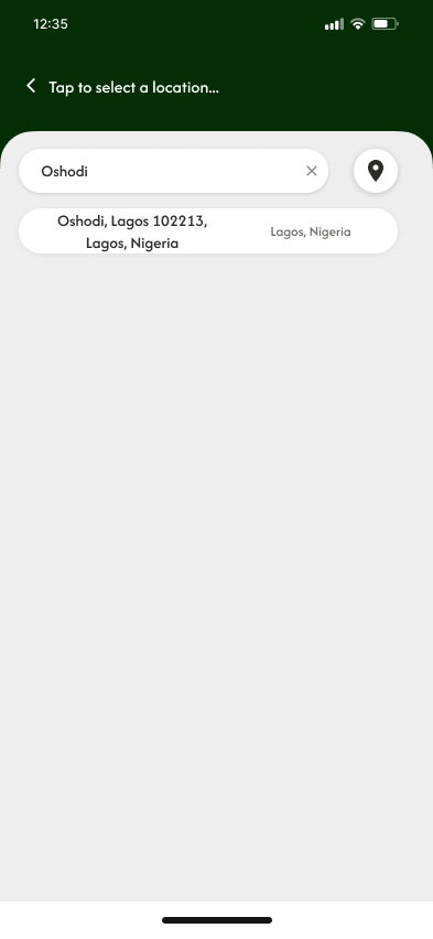
Location Setup
City search for precise prayer time calculation by location
Hadith Collection
Audio lectures organized by sheikh and subject matter

Location Results
Search results with GPS pin option for auto-detection
04
DESIGN DECISIONS
The reasoning behind every choice
01
Forest Green as the Primary Palette
Deep forest green (#1a3a1e) was chosen as the primary brand color intentionally, green holds profound significance in Islamic tradition, associated with paradise (Jannah), the Prophet, and spiritual purity. The dark green header creates an immersive, focused environment distinct from the white content cards below, establishing a clear visual hierarchy without relying on harsh contrast.
Cultural Symbolism
Visual hierarchy
02
Prayer Timeline as the Hero Element
The prayer time timeline on the Home screen was elevated to hero status, displayed as a horizontal dot-connected timeline with all five prayers visible simultaneously. This gives users immediate peripheral awareness of where they are in the day's prayer schedule without requiring interaction. The countdown to the next prayer (03:03:15) is the most prominent piece of information — because it is.
Information Architecture
Temporal UX
03
Dual-Date Display Throughout the App
Both the Hijri (Islamic) and Gregorian calendar dates are displayed simultaneously across all screens - Home shows "1 Sha'baan 1446 / 31 January 2025" while Calendar shows "8 Sha'baan 1446" with "7 February 2025". This dual-display respects that users live across both calendar systems simultaneously and eliminates the mental math users typically need to perform.
Cultural Inclusivity
Cognitive Load
04
Rounded Cards on Light Background
Content sections use rounded white cards (border-radius: 24px+) against a soft light grey (#f0f0f0) background. This card-based system allows dense content, 9 grid categories, audio lists, calendar rows — to breathe. The subtle shadow depth creates a layered, paper-like tactility that feels calm and organized rather than clinical.
Spatial Design
Tactile Feel
05
Empty States as Design Moments
The Favorites screen empty state ("No Favorite audio") treats the absence of content as a designed moment, not a failure state. The vinyl record icon with an exclamation forms a recognizable character that communicates "nothing here yet" with lightness rather than disappointment. This micro-design decision significantly impacts first-time user perception.
Emotional Design
Empty States
06
Four-Tab Navigation Architecture
The bottom navigation uses exactly four tabs: Home, Calendar, Audio, Settings. This minimal structure reflects the app's four primary use contexts. The Audio tab uses a microphone icon — reinforcing that this is primarily a listening platform. Active states use the brand green, inactive use grey, following platform conventions while maintaining brand cohesion.
Navigation IA
Thumb Reach
01
COLOR SYSTEM
A palette rooted in meaning
Every color was chosen for both aesthetic harmony and cultural resonance, anchored in the Islamic tradition's relationship with green, gold, and pure white.
Forest Deep
#1A3A1E
Forest Mid
#2A5030
Forest Light
#3D7045
Sage
#7AAA7E
Gold
#C9A84C
Parchment
#F5F0E8